At PyData Berlin 2025, I had the chance of introducing a Python library I developed called Funnelius. It’s designed to tackle a common but tricky problem in data analysis:
visualizing complex, non-linear user journeys.
If you’ve ever found yourself struggling to analyze non-linear conditional funnels or make sense of a “spaghetti” Sankey chart, this is for you.
Let’s dive in!
The Problem with Non-Linear Funnels
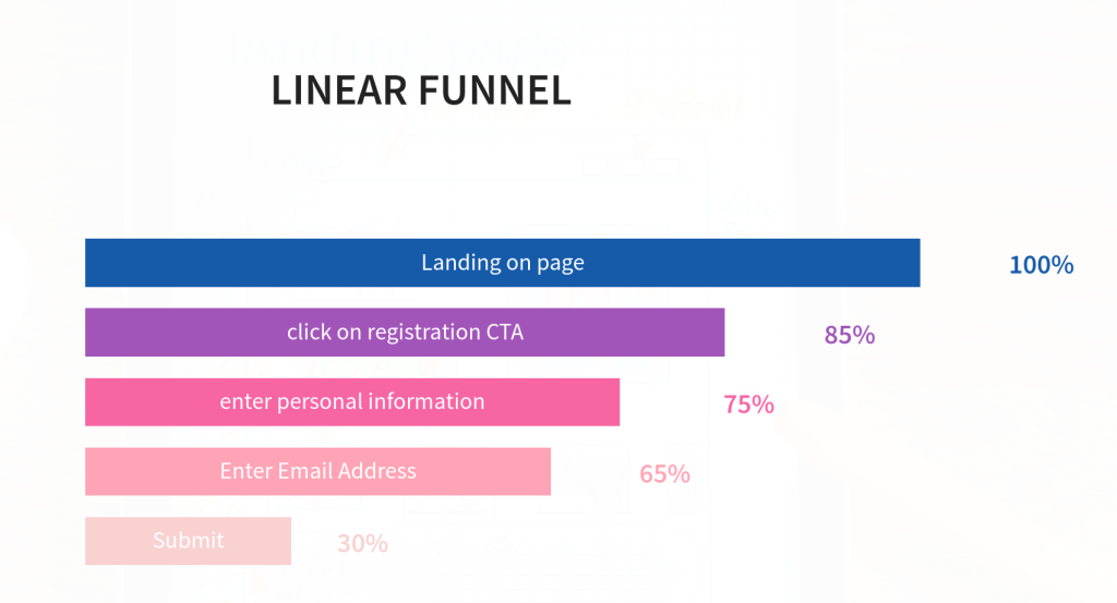
When we think of a “funnel”, we usually picture a simple, linear path. A user lands on a page, fills out a form, and registers. Each step follows the last, and analyzing performance is as easy as creating a bar chart to see the drop-off at each stage:
But in some cases, user journeys are not that simple. They’re non-linear.
Imagine a website that gives you a price estimate for your vehicle. The questions you’re asked depend on your previous answers. If you select “motorcycle,” you might be asked about the frame. If you select “electric car,” you’ll be asked about battery size:
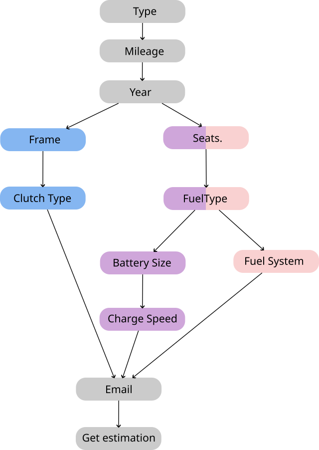
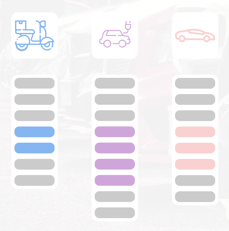
As a result, not every user goes through every step in your funnel. Users might have different journeys within your funnel and they will have different funnel lengths:
The path for a motorcycle owner might have seven steps, while the path for an electric car owner has nine.
How do you visualize this? Two common approaches fall short:
- Consolidate Steps: You could group all the “technical questions” into one big step. The problem? This creates a black box. If your conversion rate suddenly drops within that step, you have no idea which specific question is causing the issue.
- Use a Standard Journey Visualizer: You could feed your event data into a tool like a Sankey chart. The chances are you’ll end up with a messy, unreadable “spaghetti diagram” that’s impossible to interpret.
This is precisely the problem funnelius was built to solve.
The Solution: Funnelius
funnelius is a Python library designed to quickly and easily visualize these complex, conditional funnels.
Install Funnelius
Installation is straightforward. You can do it easily using pip:
pip install funneliusPrepare data
First, you need data. The library expects a simple Pandas DataFrame containing your event logs with four key columns:
- user_id: A unique identifier for each user.
- action: The name of the step or event (e.g., ‘select_vehicle_type’).
- action_start: The timestamp of when the action occurred.
- answer (Optional): The user’s answer or input at that step.
you can download an example file in CSV format here.
Analyse Funnel
In order to analyse and visualize your funnel, you just need to Import the library and pass your DataFrame to the render function:
import funnelius
import pandas as pd
# Load your event data
df = pd.read_csv('your_event_data.csv')
# Generate the visualization
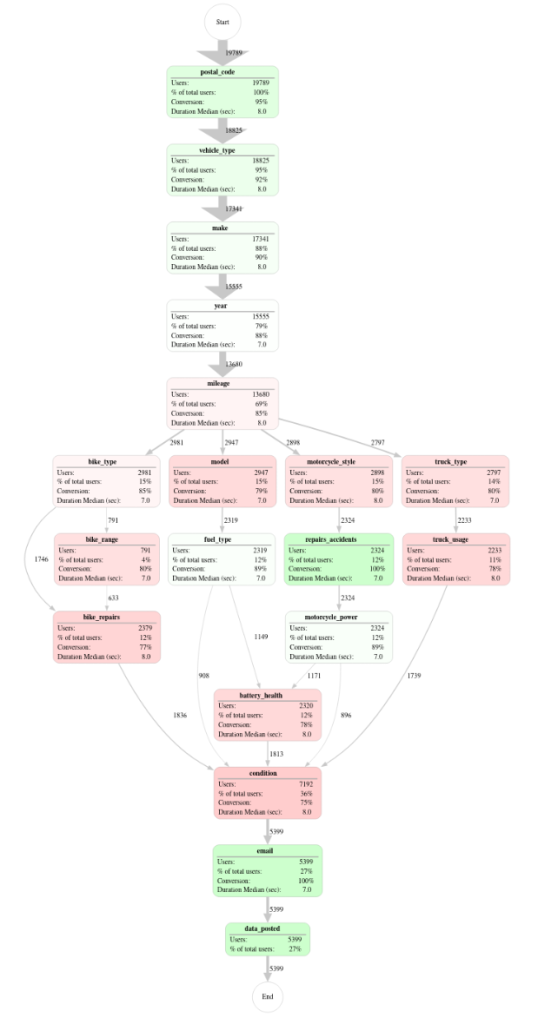
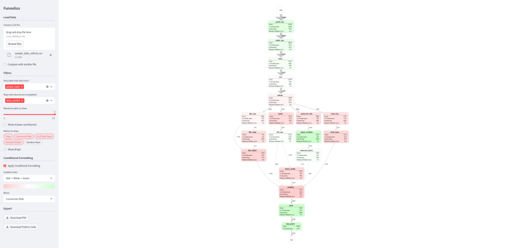
funnelius.render(df)This single function call produces a clean, insightful graph with all the crucial metrics calculated for you right out of the box:
You can later customize it with passing various parameters to render function.
Interactive Method
There is also an interactive mode, which helps you visually fine-tune the visualization using a web app and generate the python code for it. You can launch it from your terminal:
import funnelius
funnelius.interactive()
This opens a web app where you can upload your data and play with the parameters:
Let’s walk through what you can do:
Cleaning Up the Noise
Real-world data is messy. Broken user sessions, ad blockers, or tracking issues can create dozens of illogical user journeys, resulting in something similar to that spaghetti graph:
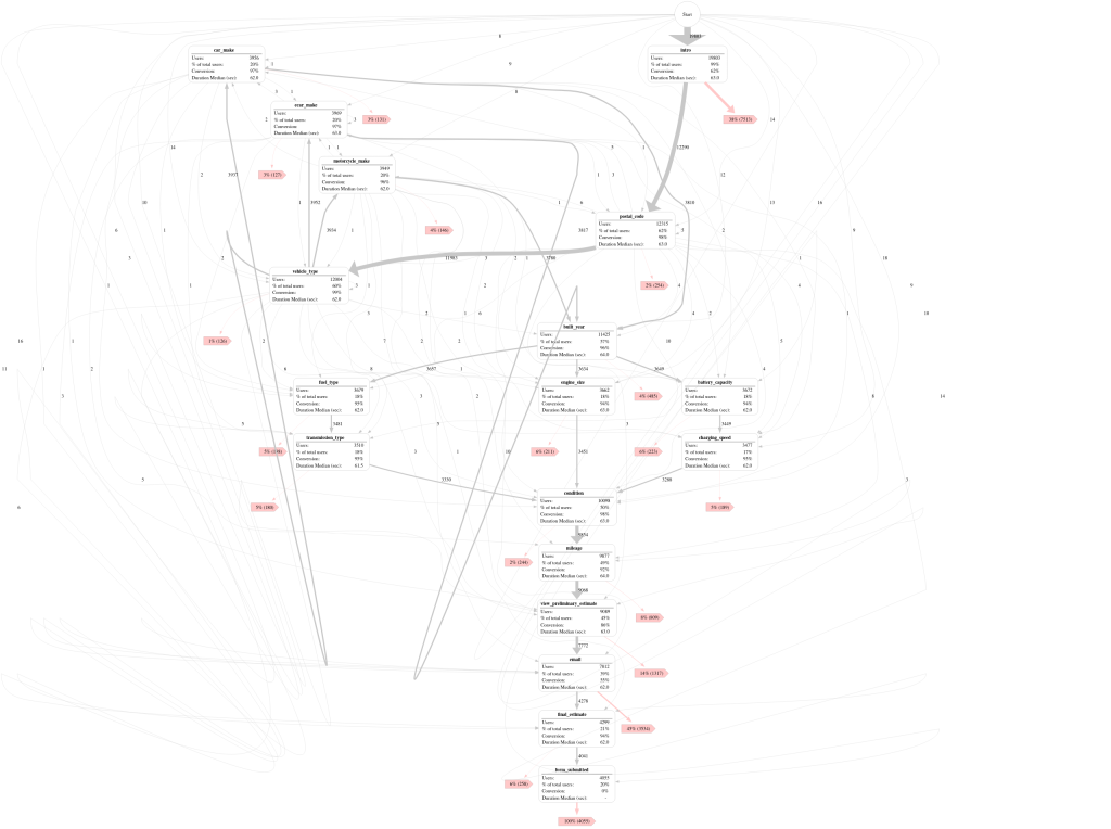
The initial data showed 145 distinct user journeys.
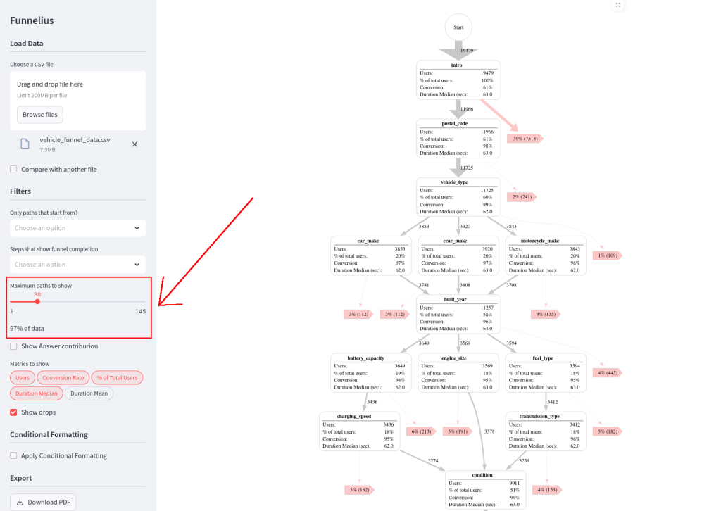
But with funnelius, you can easily filter this noise. By adjusting the “max paths to show” parameter, you can focus on the most common journeys. Here, by reducing the paths from 145 to just 30, I filtered out only 3% of the total data but eliminated nearly 80% of the confusing, low-traffic paths. The result is a much cleaner and more readable graph:
Key Metrics and Insights
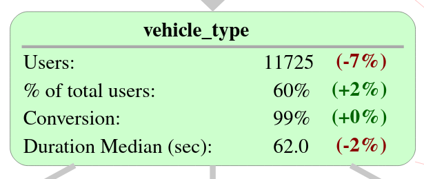
Each node in the graph is packed with these information:
- Number of users who reached the step.
- Conversion rate to the next step.
- Median duration spent on the step.
- Drop-off percentage.
You can use conditional formatting to automatically color-code the nodes based on a metric like conversion rate, instantly highlighting problem areas. Using conditional formatting we could immediately see that the “email” and “intro” steps had high drop-off rates:
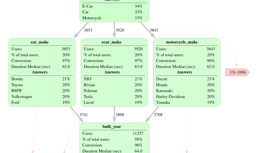
Analyzing Answers and Goals
Remember the optional answer column? If you provide it, funnelius can break down the contribution of each answer within a step. You can see what percentage of users chose each option and how that impacted their journey.
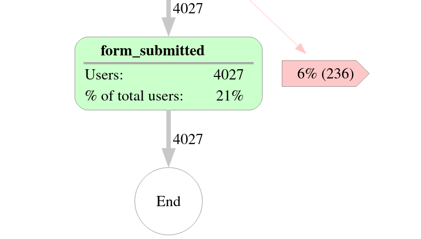
You can also define goal_steps (e.g., ‘form_submitted’). This tells the library that users reaching this step have successfully converted, preventing them from being incorrectly counted as a drop-off:
Comparing Two Funnels
Another feature is the ability to compare two datasets. Simply provide a second DataFrame, and funnelius will calculate the percentage change in conversion rates and answer distributions between the two. This is perfect for A/B testing or analyzing the impact of a product change.
Exporting Your Work
Once you’re happy with your visualization, you can:
- Download a PDF of the graph to share with stakeholders.
- Download the generated Python code with all your chosen parameters to reuse in your scripts or notebooks.
- Export the processed data (nodes, edges, answers) as CSV files for further analysis.
Under the Hood: The Libraries I Used
funnelius is built on top of some fantastic open-source libraries:
- Graphviz: This is the powerhouse behind the graph generation. It’s an incredibly robust library for creating all kinds of network diagrams and flowcharts.
- Streamlit: This library makes it incredibly easy to turn Python scripts into interactive web apps, which is exactly what powers the interactive() method.
- Pandas: The backbone for all data manipulation.
I’m also currently working on adding Polars support, so you’ll soon be able to use either Pandas or Polars DataFrames as your backend.
Conclusion
Analyzing non-linear user funnels doesn’t have to be a headache. Traditional tools often struggle, but funnelius is designed specifically to:
- Filter out low-quality, noisy data.
- Calculate and display key performance metrics for each step.
- Analyze the impact of user answers.
- Compare two datasets to measure change.
- Provide an interactive mode to visually build and customize your graph.
Thank you for reading and I hope you find funnelius useful in your own projects. If you have any questions about this or just want to say hi, you can find me on LinkedIn. Also if you liked it, don’t forget to check out the project on GitHub and give it a star! 🌟